Taking a brand from fragmented to fearless
The lay of the land
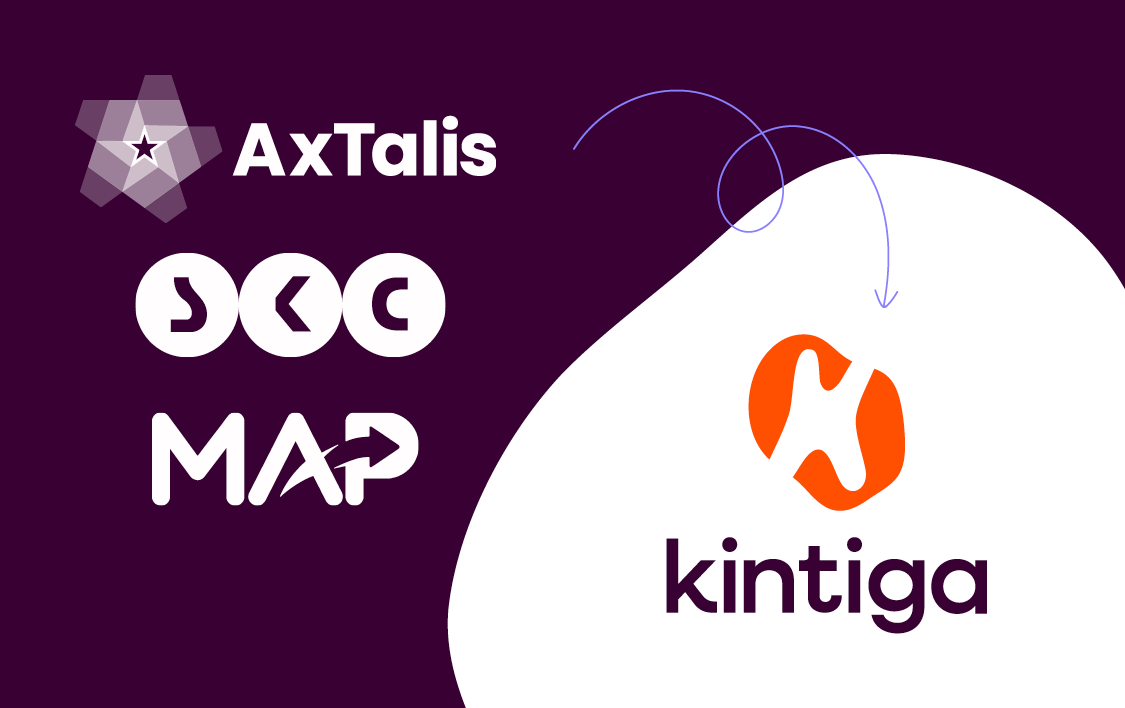
Kintiga emerged from the merger of three established market access consultancies: MAP Patient Access (UK), Extalis (Denmark), and SKC Consulting (Germany). Each had a strong legacy in its home market, but their parent company, CKA Capital, envisioned something bigger – a unified European player with a clear, compelling identity.
Rather than folding the acquired companies into MAP, the decision was made to create a new brand that respected each company’s heritage while signalling a bold step forward. They needed a name, a narrative, and a visual identity that would resonate across borders and reflect their shared ambitions in the European healthcare landscape.
What needed to change
The core objective was to consolidate three distinct businesses into a single, cohesive brand without losing the trust, reputation, and individuality each had earned in their respective markets. CKA Capital wanted more than a new name—they sought a brand that would:
- Signal a new era of collaboration and growth
- Create a standout presence in a traditionally conservative sector
- Lay the foundation for future commercial success and geographic expansion
The project required strategic sensitivity and bold creative thinking.
How we made it happen
ramarketing was brought on to deliver a full rebrand from the ground up. The approach was staged to ensure both strategic clarity and creative cut-through:
Brand strategy
We conducted stakeholder interviews across all three companies and synthesized third-party research to develop a unified brand and messaging platform. This phase laid the foundation for a shared vision and voice.
Naming
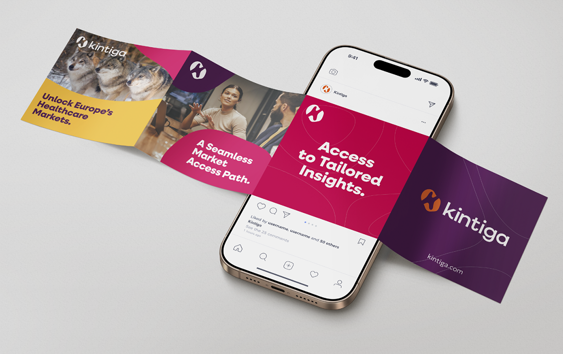
The new name – Kintiga – was inspired by “kin” (family, unity) and “kinetic” (energy, momentum), capturing both the coming together of equals and their forward-thinking mindset. The name was approved swiftly, reflecting early stakeholder alignment.
Visual identity
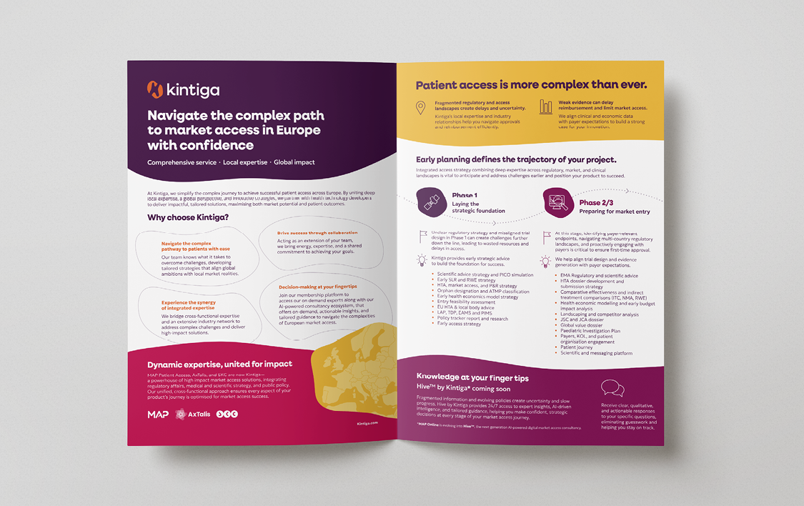
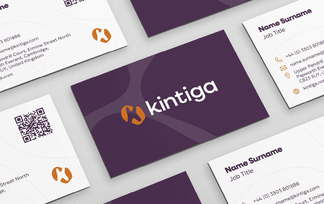
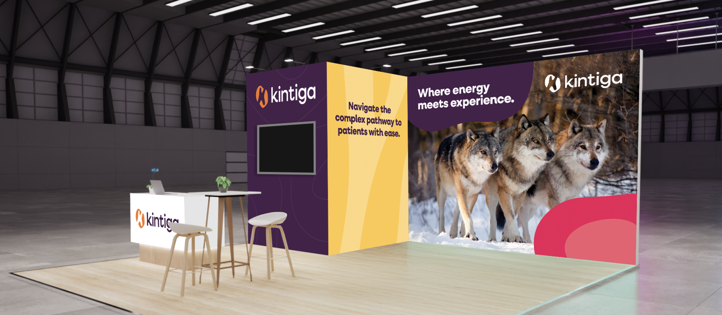
The brand concept was intentionally bold. Drawing on metaphors of animal strength and unity (lions, wolves, pack dynamics), we created a visual language that stood out in a crowded, often conservative market. The new identity drew strong attention at industry events.
Website
A full website build followed, including UX workshops, content design, and development – ensuring the new brand lived and breathed across digital channels.
Launch support
ramarketing supported both internal and external rollouts, creating launch animations, town hall materials, and FAQ documents. While the internal delivery was handled by the in-house marketing team, our assets ensured a consistent and professional launch experience across all touchpoints.
The difference it made
Despite being a newly launched brand, Kintiga made an immediate impact:
- Trade show standout: The bold visual identity turned heads at key industry events, earning praise from peers and stakeholders for its distinctiveness and professionalism.
- Media coverage: The launch press release secured strong media interest and coverage, amplifying the new brand’s market entry.
- Positive feedback: Internal and external stakeholders responded enthusiastically to the clarity and cohesion of the new identity, especially given the complexity of merging multiple legacies.